/
1
·
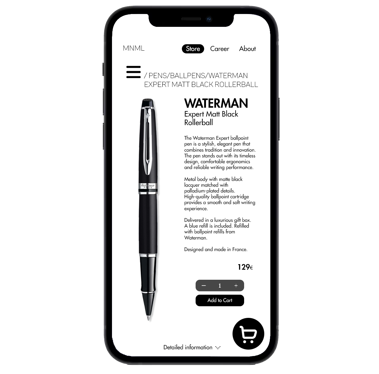
I created a user interface with the goal to design a visually clean and minimalistic phone application. This application was designed in the shape of a fictitious web shop company selling office supplies.
As a foundation I created a brandboard as a basis for the UI that would help me creat continuity and consistency. The concept of minimalism is typically associated with simplicity and having a monochromatic color scheme, but the challenge that comes with minimalistic design is to make the most out of what little you have. I wanted therefor to avoid creating individual pages for every function or source of information. Instead I wanted to incorporate functions within the same pages while trying not to clutter the limited space that is on a phone screen. Composition also becomes more important where the limited color scheme limits as use of visual attention.
Something I found by designing the pages was that by using animated menus rather than separate pages, the app felt simpler to navigate. This could however create a challenge where expanding menus clutter over existing elements and pending on how they were applied, could be rather limited in their scale. For instance, a burger menu could only reveal a certain amount of tabs before the options would go below the phone screen. The balancing between function and ease of use become the central challange.
Results can be seen below, with a video at the bottom of the page, showing the basic navigation functions of this fictitious application.